
The very first logo I ever sold (shown here in its original version). In 1976 I went to a ski & tennis shop to buy a pair of skis it had taken me 6 months to save up for. My being an artist came up and the shop owner asked me to design a logo for the store. It took me 4 hours and he gave me the skis and a boot tree in trade. $250 for 4 hours work vs the $3 an hour working in the cafeteria. New career, here I come!

I won my first design contest with this logo for Miller Foods in 1977. The original business had been Miller Chicken Farm so I leveraged their history to create a symbol more personal to them than a generic food logo. At first they pushed me to also present some alternatives. I visited the company three weeks later with some other sketches but determined to convince them that my original idea was truly the best approach. As I pulled into the parking lot I was so intent on getting to the meeting that I almost didn't notice their fleet of trucks had already been painted with the design! My longest-running logo, they still use it 46 years later. click to view page:

A logo for a local Hartford CT band 1977. In my early career I relied heavily on Letraset rub-down lettering. As my range expanded i realized that the letters available to me were expensive ($12 a sheet in 1977 money) and also limiting. I began this logo with a font called Sinaloa and hand lettered the R to fit my requirements.

1977. The second logo contest I won (presented here in its scanned and rescanned form). A local guitar player asked for a logo for his record company Guitorn (guitar and horn) Records. The design brief called for a guitar cleverly drawn. One of the competing designers, who's solution was a beautifully stylized guitar, approached me and snarled through gritted teeth, "You shouldn't have won! That wasn't what the client asked for!" I simply replied, " I didn't do what he asked for. I did what he needed." The client still uses this logo. click to view page:

1977. Logos are often driven by symbols. Sometimes a symbol becomes so strongly identified with a certain company or region that everyone else must be careful about its use. The Umbrella was an organization at the University of Hartford. The insurance capital of the world. The umbrella was so strongly identified with the Travelers insurance company that I chose to invert this one to avoid any confusion.

Logo for a sail and rowboat company in 1979. This is another logo where I stuck to my guns. The client originally wanted a boat with oars, but they kept looking like crosses or peace symbols. This logo is an "alpha glyph", a logo where the letters become a picture of the product. Here the S and C become a wave. This logo has been featured in the Font. Logo and Lettering Bible and The Secret Life of Logos..

I was 26 when I was given this account in 1984. I had just opened my studio on Union Square NYC and my furniture had not arrived yet so I hand-lettered this on a door across 2 boxes. This was my entry into designing major corporate logos.

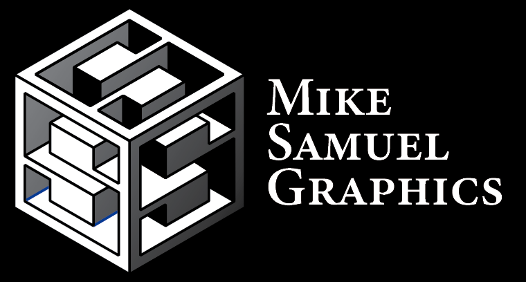
I designed this in 1995. My first photographic logo. On a Mac IIci, a $6500 computer with 4mb of RAM. To render an 8x8 inch 70 megabyte file at 600dpi took 20 minutes when it didn't crash the computer altogether. As a result I had to design each facet in an individual file and assemble them at the end of the day. So the job was done mostly from memory.

This company was founded in 1905. I was very young then so this logo was a rebrand I hand-lettered in 1990 when computers were still not so great at vector art. The older logos had lower case "N's" and a proportionally larger box. My contribution was the capitol N's and more modern letter spacing. The company has had about 10 logos throughout its history.

This is the first logo I ever did on a computer. A Mac Classic circa 1992 with a teeny monitor in a program called Freehand. Because of all of the basic geometric shapes I thought it might be easier. It wasn't. I could have hand-lettered it much faster. Then the client called and asked for an outline version as well. Aha! Ten minutes (and an additional logo fee) later I thought, "These new computers might be of some artistic use after all."

1996. This was a cover for a friend who was submitting a demo tape to a record company. I eagerly awaited her return to discover the outcome of the meeting. "Well, I did lousy but YOU did great." She said with a sigh. "What does that mean?" I asked. "They didn't like my music but they liked your cover artwork so much they want you to design their logo!" The logo for Gaia Records was the result.

1996. This is the logo referred to in the previous story.

2019. The client had an interesting complaint about this logo: "Every time we set up speakers for a concert, everyone wants to know where they can buy a t-shirt with the design on it!"

1995. I have had a lot of wonderful reactions to my artwork but this one remains my favorite. I could hear them on the phone when the fax came through and the client exclaimed, "Oh shit! Look what he did!"

2003. Some days I was especially glad to have gone into the studio. This company called me at noon to say that they needed a logo QUICKLY! Their original designer hadn't come through and their website was going live that evening. I designed and rendered this logo by 5:00 pm. They were overjoyed and apologized for only having $7500 in the budget. Ah... the days before the global economic depression.

2019. I like this logo because just as the fuel product has zero emissions the letters of the logo don't really exist either. You can only see their shadows.

2003. This is one of my most involved alpha-glyphs. The brook forms a pregnant belly, and phases of the moon form the fetus within.

2005. Using landmarks in logos is powerful and evocative. This is the Space Needle in seattle with a Go stone being placed on the top.

2006. What's in a name? The client and I were struggling to come up with a solution for the previous name of this venture. She called me at 6:00 am to say that she had decided to switch to a new name, Cornerstone Capital. My head rocked back and before we even finished the phone call I emailed her this solution. She said, "Brilliant. I'm doubling your fee!"

2013. The design brief here was to make the logo Jewish, but not too Jewish. So I hid a star of David between the people holding hands. This was one of my many "one sketch" logos.

2017. No one can design in a vacuum. My original sketch for this logo was quick and lopsided, but when I translated it to the computer it had lost some of its whimsey. My partner (and design editor) Heatherly, kept saying,"Cuter! make it cuter!" It's still maybe not quite as cute as the sketch, but the client loved it.

2018. A lesson I have learned is: If you're going to go to the trouble of dating smart women, listen to them! The client on this job originally rejected the idea of an elephant theme. I sketched this for my own satisfaction. My partner Heatherly said, "Show it to them. They haven't seen THAT elephant!" I replied, "The client specifically said, 'No elephants.'" *Frown from Heatherly* Guess which one they picked.

2012. I was designing this logo for a flash-frozen cocktail company. I had a vague idea about an iceberg and another triangular shape but I couldn't quite see it. My then 12-year-old niece Julia said, "What about putting a liquor glass over the iceberg?" I said, "Nice idea but it would be upside down." Then it hit me. Brilliant niece. I bought her a Wacom tablet with part of the fee.
2023. I dropped by my brother Steve's Design Visionaries engineering office and a client of his was presenting an idea for a prototype. A spring-like device to hold open oil wells. Steve said, "You should have Mike design a logo for your project." 2 hours later I showed him this. The invention is sparking interest across the oil industry.

2019. I had the honor to work with Lori Anzalone and Gary Burden to create the back album cover for Neil Young's Psychadelic Pill. Type in a spiral embossed into a tablet. Nice to be part of history. click for Lori's page

2003. A good corporate logo has to work in many varied environments, and as such should be relatively simple and iconic. A local logo can be more whimsical. Here I managed to include the George Washington bridge, a comedy mask and a film strip.

2008. This logo should be on an "almost famous" page. A venture by 2 of the founders of Starbucks. I was working on coffee bean images when this solution popped into my head. I sent it to the client at 2am and they were delighted. We designed posters, interiors and china and menus. It would have been everywhere, but they didn't get a second round of funding.